Blend Bistro
I was the lead developer and was in charge of making high-fidelity wireframes into a responsive website utilizing HTML5, CSS3, and Bootstrap. I utilized the mobile-first approach when styling the webpage, which helped with the mobile wireframes I achieved a website that is responsive.

Fresh Eats
The Fresh Eats project involved developing a single-page website for a meal prep delivery service. Among other features, it includes details about how the service functions, meal plan pickup options, and responsive images. Emphasis has been put on making sure the website is mobile-first, using SASS for advanced styling in mixins to have reusable CSS components and media queries to change the layout depending on the size of the screen. The brief was to have an engaging and responsive page that carried a message of what the service could offer and delivered it seamlessly on any device.
Click the button below to explore the project on GitHub.

Bootstrap
The goal was to develop one web page using the Bootstrap framework, version 5.3. It should include a container and two images, one card component, a call-to-action button, and header tags. Moreover, there was some placeholder text, lorem ipsum, and a navbar at the top of the page. I did this using the latest version of Bootstrap. I was able to override the existing Bootstrap styles with my design elements by including an external stylesheet that customized them. This further attested to how, from a base of a pre-built framework, I could add tailored styling to suit the specific needs of a project.
Click the button below to explore the project on GitHub.

UX Project
Lois Allen, Aaliyah Wycoff, Lita Salinas, and I were tasked with analyzing the Baskin Robbins website. The project began with a competitive and comparative analysis between three websites: Baskin Robbins, Vanilla Bake Shop, and Sweet E’s Bake Shop. This analysis reviewed how easy, difficult, and efficient it was to order a cake from each site. We kept a very detailed journal about every point of frustration and the actual time and number of steps it took to complete ordering from each site. After that, we made a heuristic evaluation of Baskin Robbins’ website, with Jakob Nielsen’s 10 principles for interaction design as the framework. This further detailed different areas that needed an overhaul, including consistency and standards, flexibility and efficiency of use, and aesthetic and minimalist design. Major issues included link styling, a clearer display of price range values for cake options, provision for input fields for coupon code entry, and the like in terms of aligning elements. To better understand the users, we came up with two user personas based on the research data and simulated their use of the Baskin Robbins website while identifying any issues faced by them. The issues were screenshotted and presented in detail in a presentation. We included in the presentation our process of analysis, extensive details of user personas, wireframes both low- and high-fidelity, and a prototype prepared in Figma. Although the prototyping phase was challenging because I had to learn how to prototype, I adapted very fast and was able to make a working prototype. In our presentation, we outlined various recommendations for the betterment of this website, such as resolving issues of overlapping display of elements, setting a starting price for cake options, displaying pink for all clickable elements for non-technical users of the website, and making the website responsive.
Click the button below to view the Figma Prototype.
Client Blog
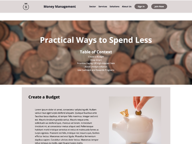
A client, Latoya Chaplin, had requested a blog about money management with an emphasis on the practicality of saving expenses. This incorporated design specifications from two reference websites: Uber and Starbucks, to guide layout and feel. This project was really heavy on applying graphic design principles, mainly hierarchy and alignment. The client had also specified font choices that would use specific hex color codes for brand consistency. The final deliverable was supposed to be a working blog post platform, calibrated towards the client’s content on effective money-saving strategies.
Click the button below to explore the project on GitHub.

Tribute
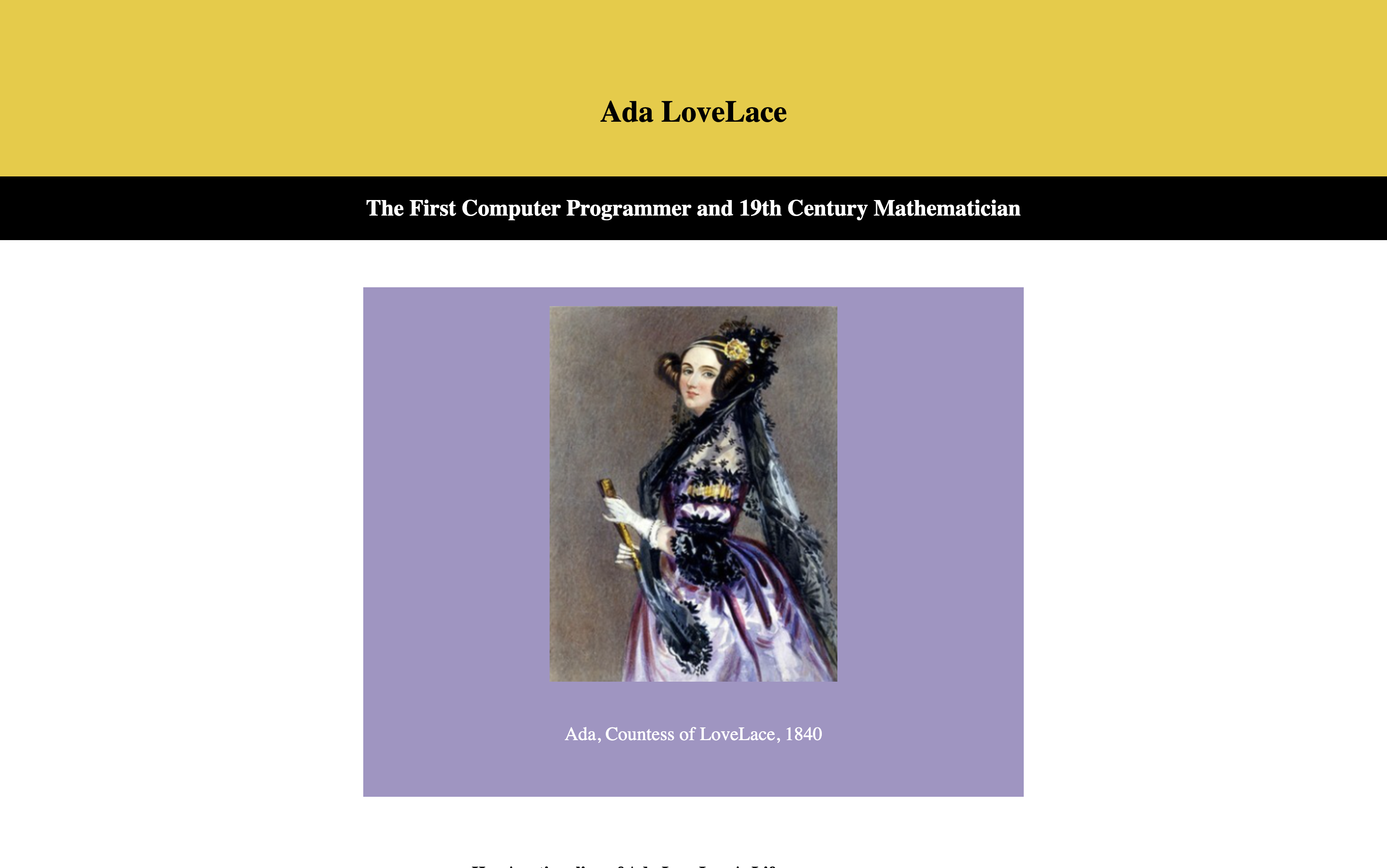
This work on The Tribute Project is a recreation of a one-page article concerning Ada Lovelace, guided by a JPEG image provided as a reference. The task at hand was to replicate this page structure and its design using HTML5 and CSS3, with all elements from text and image content to general formatting. This project entailed structuring such content with HTML5 in a very similar way to the organization and hierarchy set out in the original image. Then, it realized the same styling with CSS3, where layout, typography, color schemes, and every other detail are realized precisely. I utilized internal CSS for styling, showcasing my ability to manage and apply styles directly within HTML documents for effective design control. This exercise highlighted how to transform a static design into a live webpage.
Click the button below to explore the project on GitHub.
